Individual work inside the project
Researching for:
Character design, Backgrounds, Props and Colour
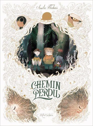
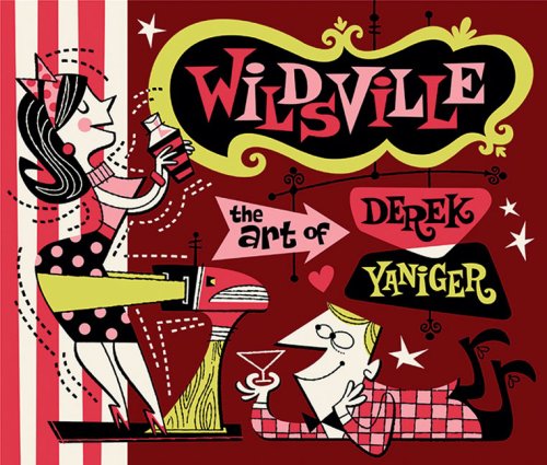
We had two Illustrators as a reference: Amélie Fléchais and Derek Yaniger. I was really lucky because Amélie is one of my favourite illustrators, and I have not only some of her books at home, but also I borrowed books from the library while I was doing a lot of online research.
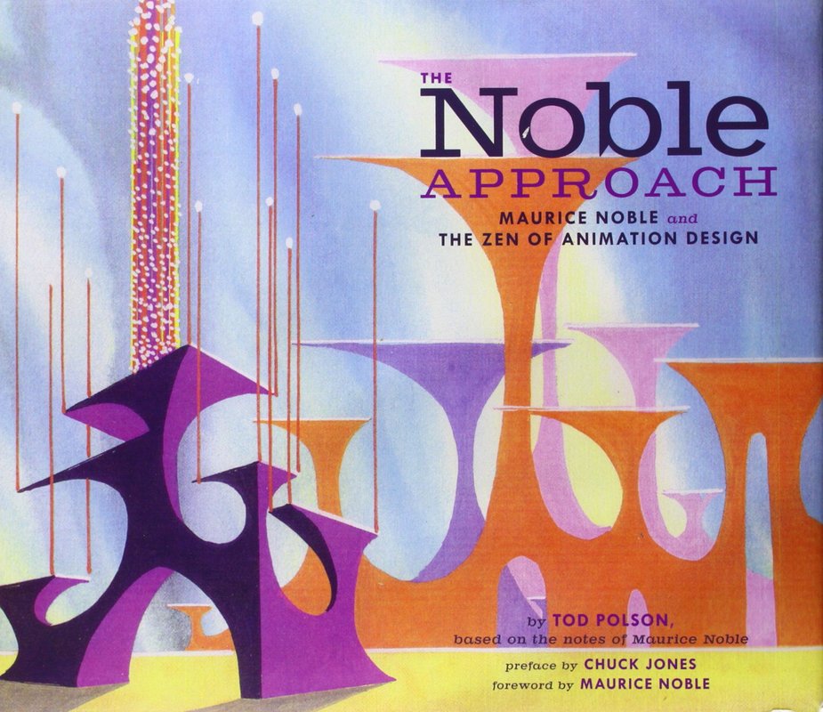
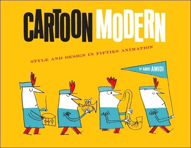
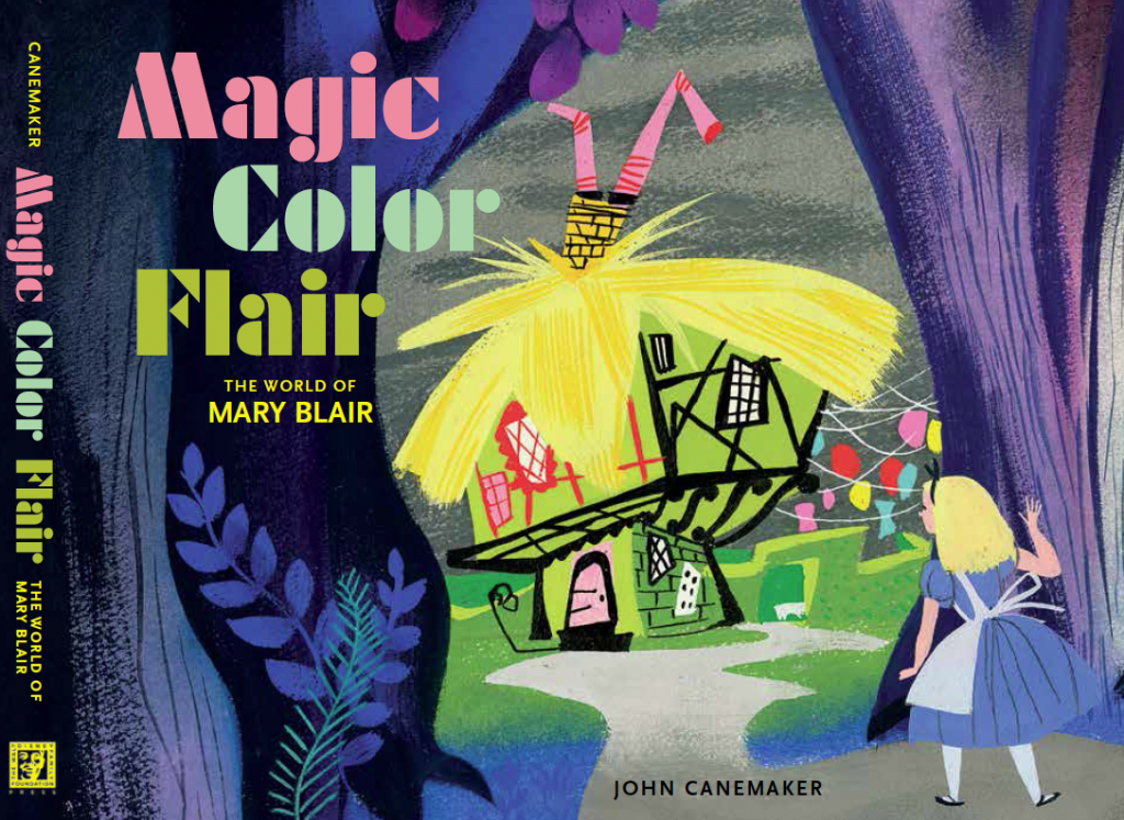
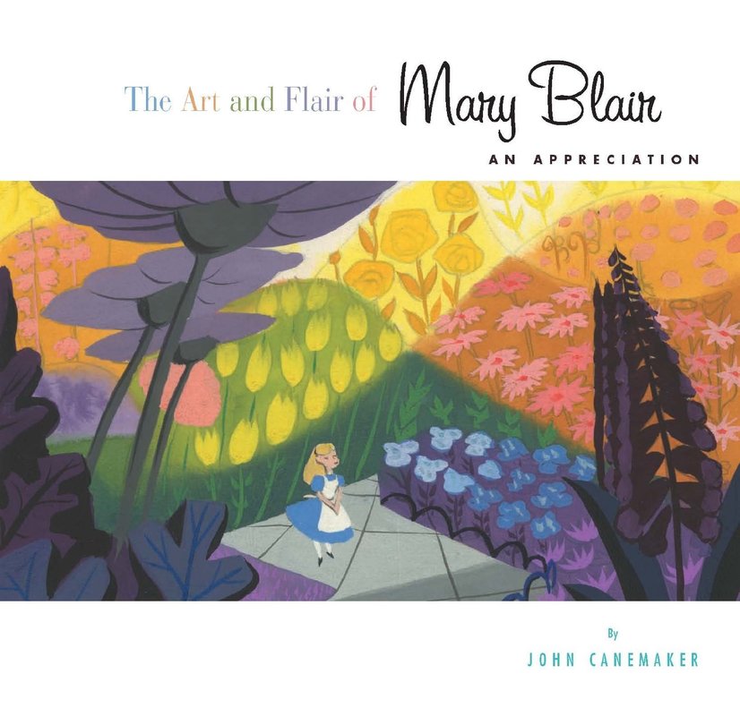
Apart from the two illustrators that we had been given, I have also used other references such as Maurice Noble, Mary Blair, Sue Mondt, Gael BECU, and the background artists from the series Samurai: Jack Bill Wray, Dan Krall and Scott Wills.
You can see in the Pinterest link below that I have put together all the references that I have used for each aspect of our project, so the team had them as well.
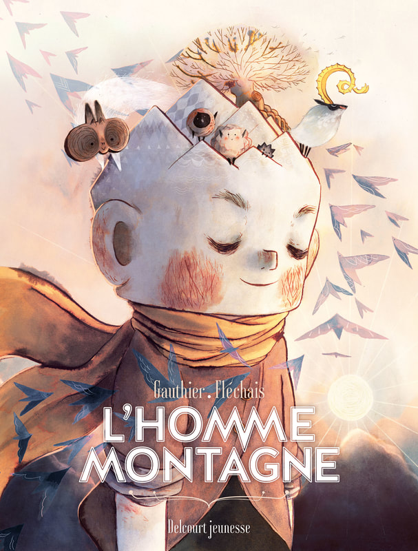
Some Books that I use as a reference
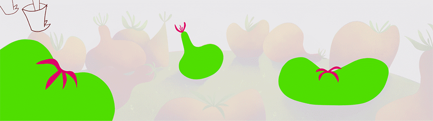
Colour script
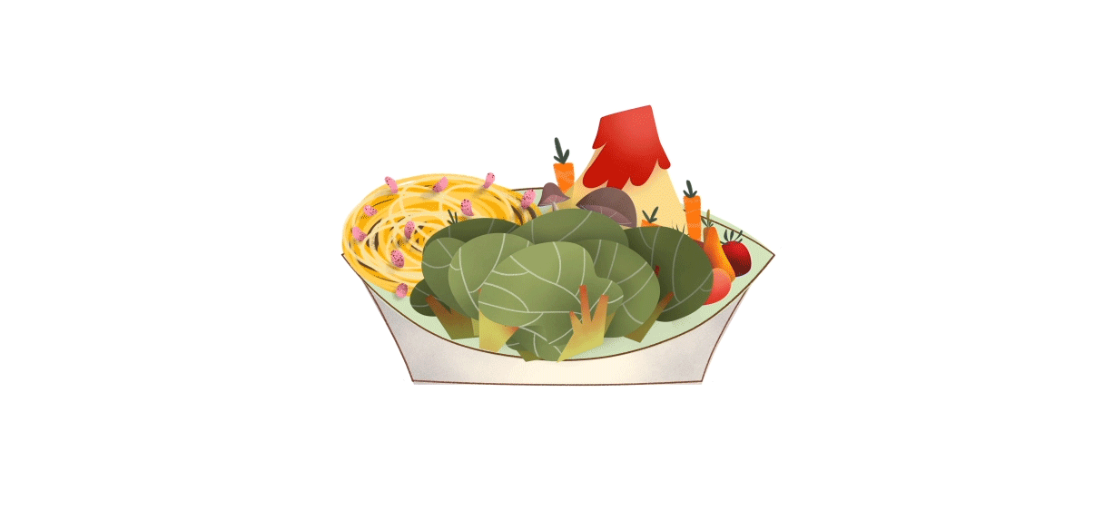
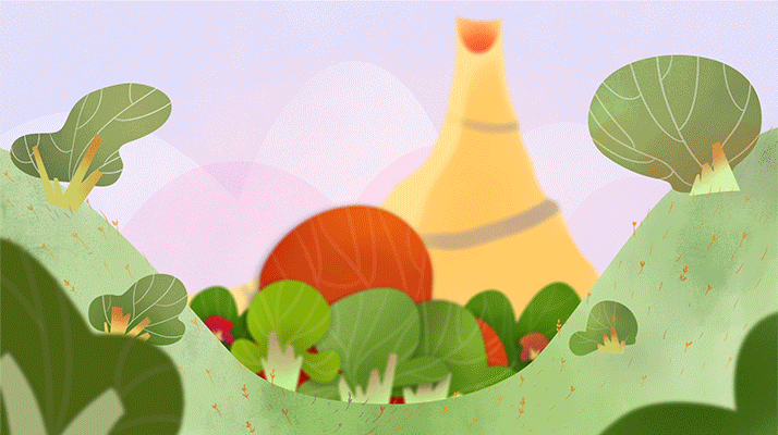
Colour was a really difficult choice for this project because we were creating an imaginary world using “real” food. As we were changing the food shape in Bay’s imagination, we could not change the colour of that food otherwise it will be really difficult to understand.
As said before, one of our reference options for this project was Amélie Fléchais, so we choose some of her illustrations which had a lot of green, orange, and red colours, as a reference for our project. Nonetheless, we also tried to go for a bit more cheerful colours as Amélie's style is sometimes quite dark.
As said before, one of our reference options for this project was Amélie Fléchais, so we choose some of her illustrations which had a lot of green, orange, and red colours, as a reference for our project. Nonetheless, we also tried to go for a bit more cheerful colours as Amélie's style is sometimes quite dark.
Different researchs of colour
Final Colour Script
BAY Character Design
I have been the Art Director on this project and I did Bay’s design from our brainstorming. Bay is a non-gender kid around 5 years old, who is a happy cheering and a bit mischievous kid that enjoys a lot eating their meals and has the great capacity of creating a fantasy world using the imagination.
Bay went through a lot of stages because the production was taking shape at the same time as the design creation. Although at the beginning Bay started being a non-human kid, we end up choosing a design that you can easily relate to as a human. Furthermore, as I need to warm up my character design skills, and because the story was changing through the design stage, I was doing hundreds of variations until we reach the final design.
About Bay´s costume, we started using “Kigurumis”, which is a Japanese costume full-body pyjama, but as we wanted all kids to be able to relate to Bay, we decided to create a carton handmade costume that a kid like Bay would make.
In regard to the colour of the skin, we tried all kind of different colour variations having into account our colour references. Finally, we decided that the one that fits the best within the general colour world was the cream.
Sketches |
Final research on colour and design |
|
Little note, please make sure you scroll tough all the galleries as most of them have more images.
|
|
Final design
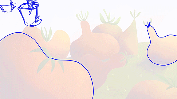
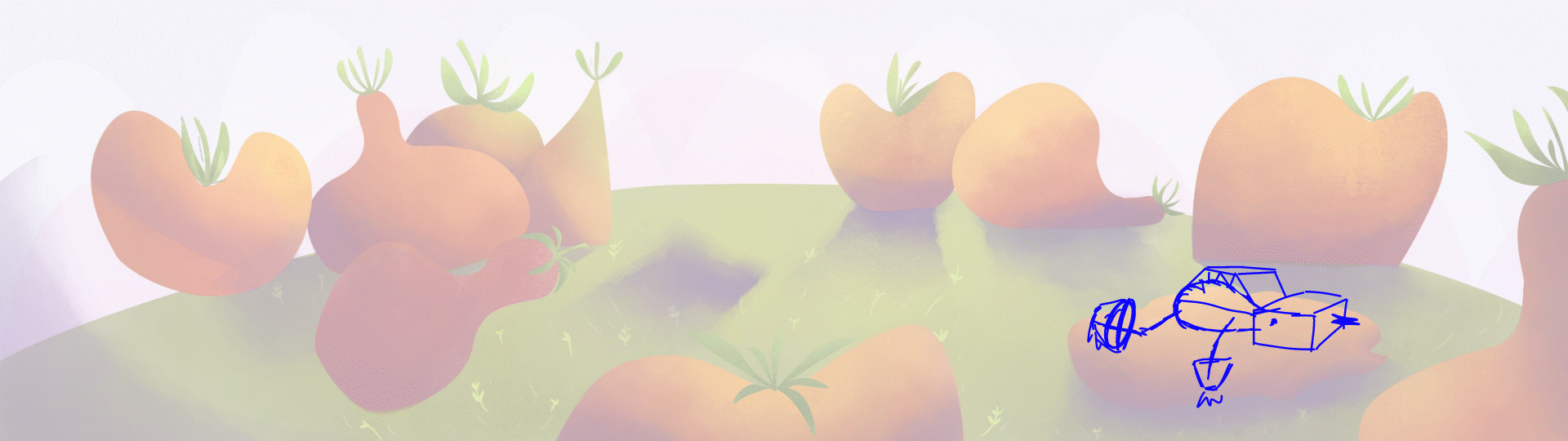
Backgrounds, Props and Layout
I was really excited doing backgrounds so I tried to explore all kind of possibilities keeping always in mind our style reference and the storyboard. All this research allowed me to learn a lot about composition for animation and open my mind to a whole new concept of creating. I think that doing the backgrounds was the part that I enjoyed the most in the entire production.
Furthermore, we were doing the layout at the same time as the backgrounds, so as soon as we had the layout sketch, which were the same for the background, we were able to start the animation while working on the final version of the background.
Furthermore, we were doing the layout at the same time as the backgrounds, so as soon as we had the layout sketch, which were the same for the background, we were able to start the animation while working on the final version of the background.
Sketches
Shot 02 |
Shot 10 |
Shot 07 |
Shots 01 and 12 |
|
|
|
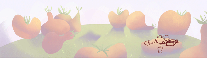
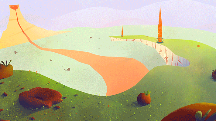
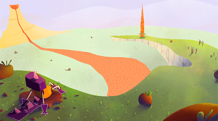
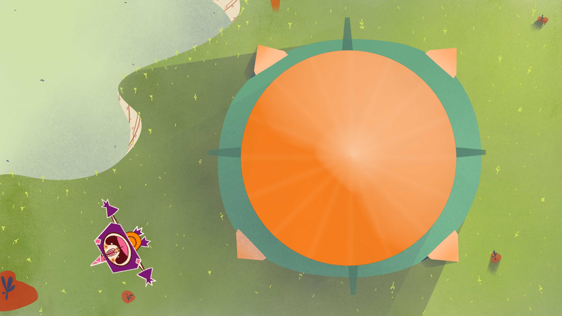
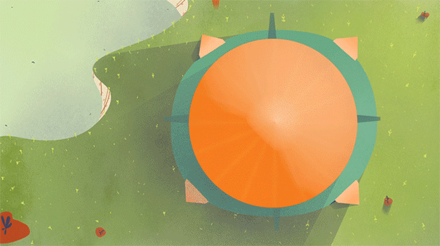
Final Backgrounds
For other shots with only sky, we re-used the sky from these backgrounds
Designing Pops
Doing the props was also a really interesting part of the production as I was trying to reach different approaches following our design reference. By doing that, I learned that if later on I am told that I need to adapt myself to a particular style I would be able to do it.
Animation and Editing
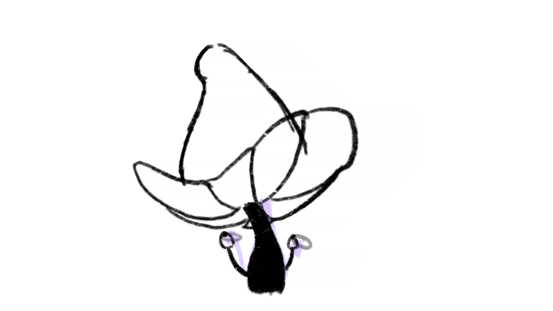
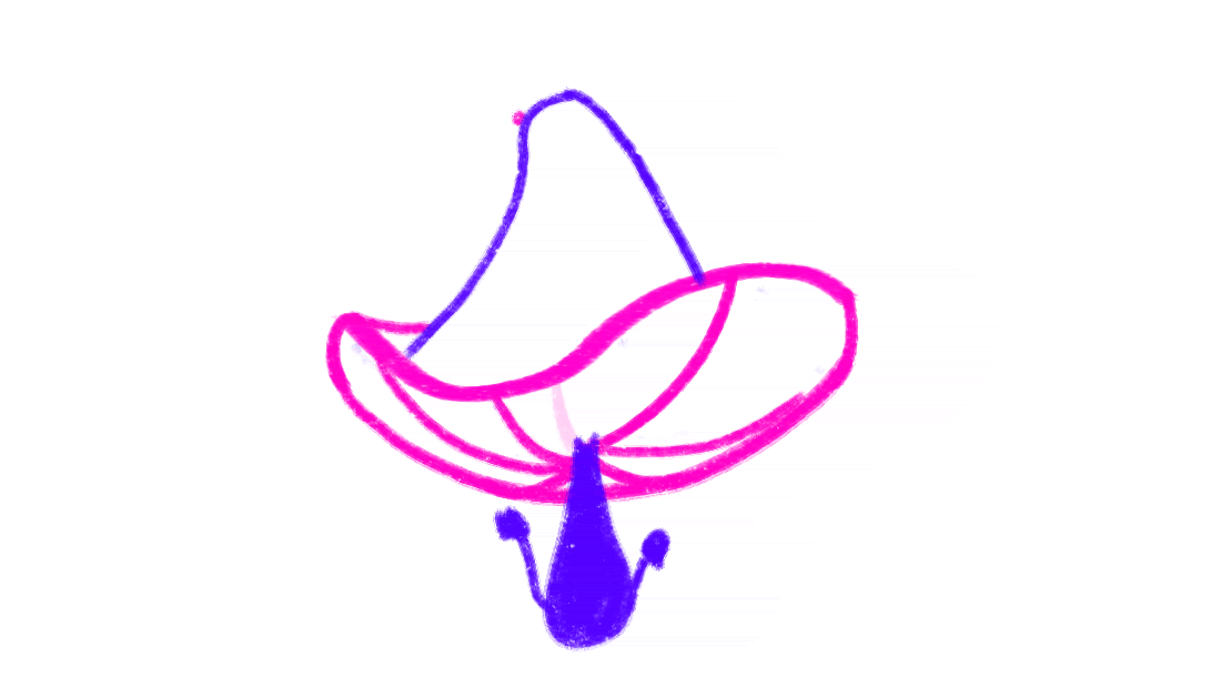
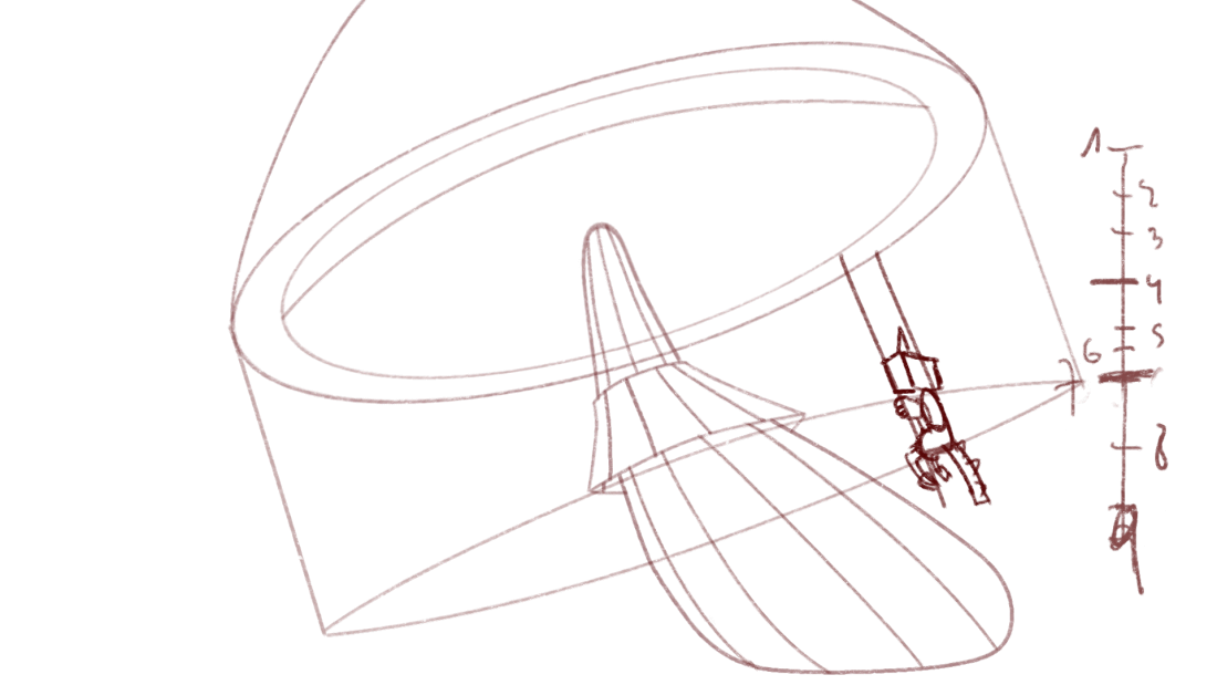
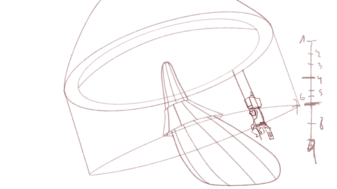
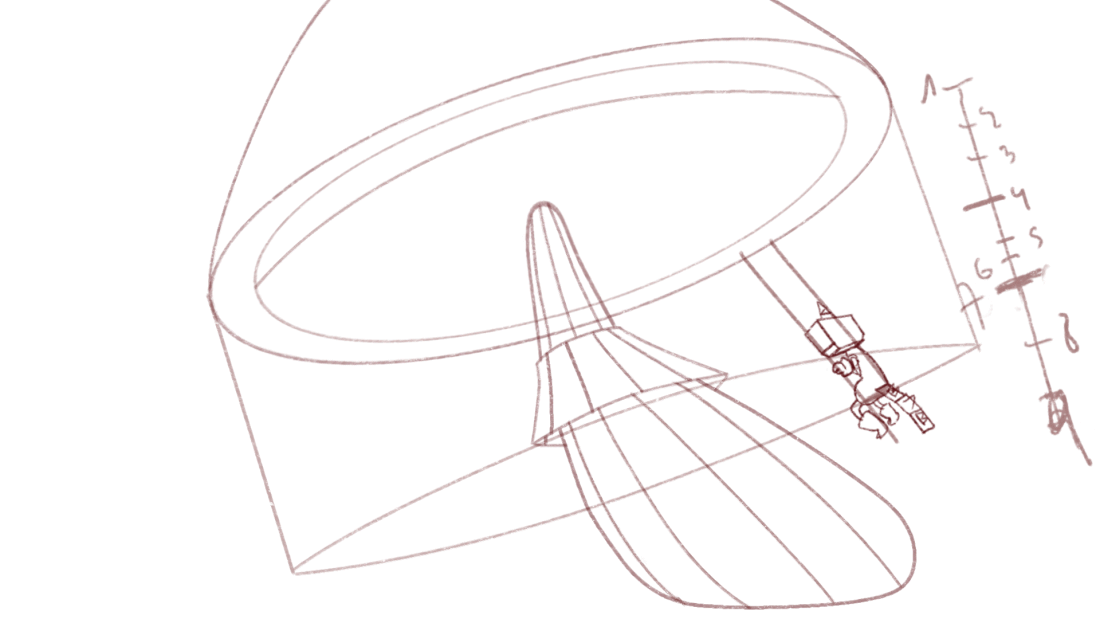
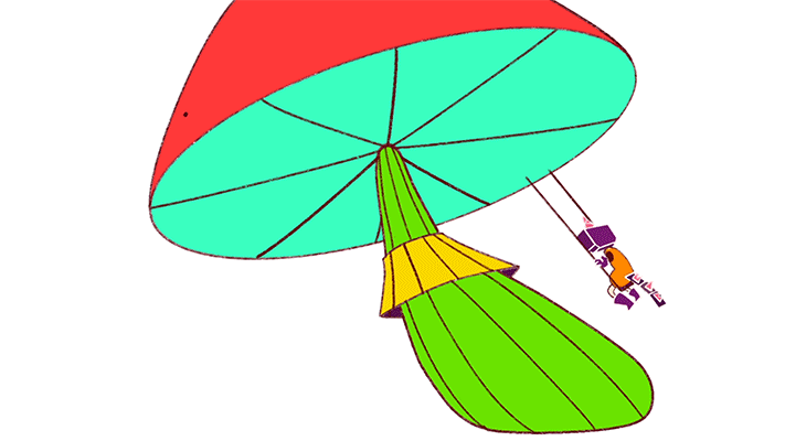
Regarding to the animation, I see a great evolution since last year in my animation skills, thanks to the project that I have been doing from February until the beginning of September, and some of the practices that I did in my own time. I really enjoyed doing difficult perspectives as you can see in the tomatoes, by that I am not saying that is a perfect job, I can see some mistakes now that is finish, but I thinks that good so I am learning an improving each time. I did a lot of research in carousels in youtube to understand how the movement of the base of the mushroom works, and even at some point I felt a bit ill watching the time the same round movement.
Shot 08
I did the animation, clean, colouring and the editing of the shot 08
First crazy mushroom
|
Let's try less movement
|
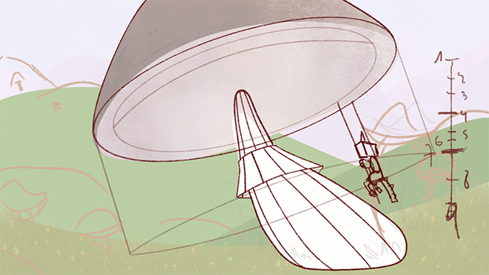
Start animating first rough jump
|
A better done jump
|
Rough clean and adding more movement to the legs
|
Adding more angle
|
Clean up and prepared to add textures
I also did two more swings to make it look more as a real carousel
|
|
Shot 09
I did the animation, clean, colouring and the editing of the shot 09.
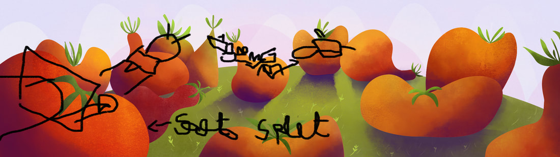
I split this shot in two parts to make the animation easier for me
I split this shot in two parts to make the animation easier for me
Part 1 tests
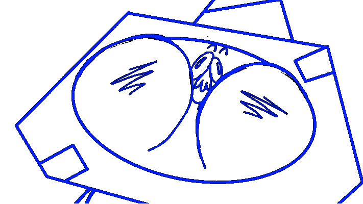
Sometimes when I am animating and I go to sleep I suddenly wake up in the middle of the night with a better option of movement for the character. Knowing myself, I keep my computer next to my bed so I can do fast drawings with the trackpad if needed. Please do NOT try to understand what is written in the image because I can not understand it myself.
Final rough animation and testing the pan
Having the tomatoes prepared for texture
|
Part 2 testsFollowing what I said at the part 1 of waking up in the middle of the night, sometimes I dream with a good movement that I can apply to the animation as it happened in this part.
First rough
Final rough
|
Shot 10
I did the animation, clean, colouring and the editing of the shot 10
First test of smoke and quake
|
Second test, animating the lava and testing Bay colour with the animation
|
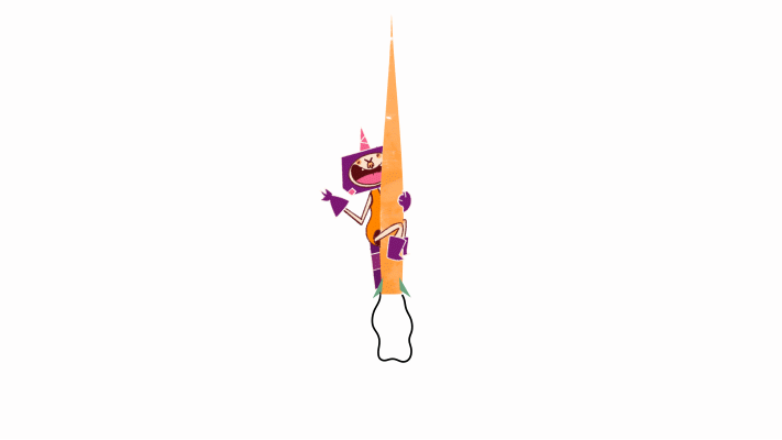
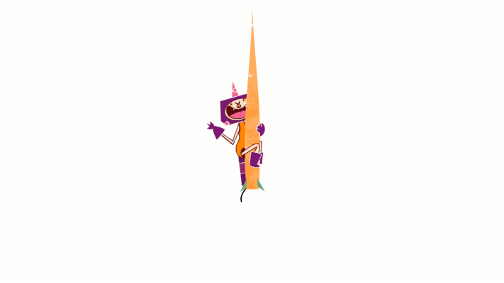
In this shot, we have Bay only watching the carrot rocket taking off, and as our animation reference was Fairly OddParents I tried to do the smoke of the rocket in a similar style.


Shot 12
I did the animation, clean, colouring and the editing of the shot 12
As this shot is really short, I just did a couple of tests an play around with After Effects
Still image, without the smoke
|
|
Shot 3
I did the cleanup, colouring and composing for this shot
Also, I amend a couple of things as the flipping the character to the right and fixing some lines to match with the actual character design.
Also, I amend a couple of things as the flipping the character to the right and fixing some lines to match with the actual character design.
Rough animation that I was given
|
Final clean up
|
Shot 1 Transition
I did the composition of the two shoots and the animation of the transition
I think this transition was the most challenging part in After Effects that I ever done because it has it has a lot of moving components, such as the the animation of the title and the broccoli transition, and making all look like as everything it was done in only one shot.
Each broccoli has his own 4 pin puppets and movements, so each little change means a lot of time that I need to spend in minor tweaks, however I learned a lot with this composition and really like the final result
Each broccoli has his own 4 pin puppets and movements, so each little change means a lot of time that I need to spend in minor tweaks, however I learned a lot with this composition and really like the final result
I composed this shot first in After Effects
|
This is how the broccolis’ movement looks like without the close up. It looks a bit odd when you see it from this perspective, but actually works really nice with the camera movement.
|
I composed this shot adding the depth of field and setting the shot for the transition.
|
Credits
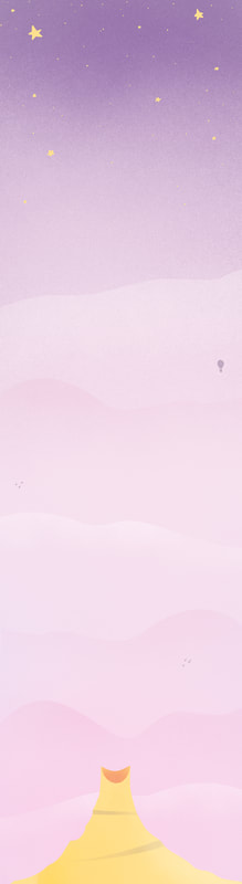
I create entirely the credits, the background the animation and the text animation as well, Using the same font as in the poster.
The movement of the rocket, the text and the start lights are done in after effects.
The movement of the rocket, the text and the start lights are done in after effects.
In this first test I was thinking to do the fire as sauce.
In this test, I wanted to try to do only a line of movement and add a shape with semi-transparent colour in After Effects
|
Background for the credits
|

None of the above tests were good enough for the animation, so I did further research on the Fairly OddParents series and I had as a reference how they do the fire in the rockets but I did a simplified version of it.
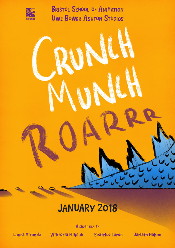
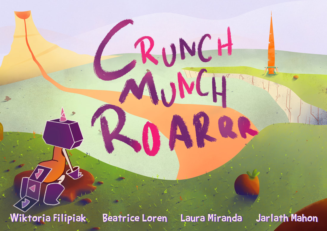
Poster
I create the poster design and help researching the fonts that we were using.
Poster options |
I did a little model to research in the shadows |
Final poster
Animation Bible
For the bible I created a new image for the back cover as you can see below, I also did the composition for the cover. Furthermore, I wrote the colour script, the character design and the moodboard sections.
|
I did this background only for the back cover of the bible
|
Festival Form
The festival form was made collaboratively in between Beatrice, Wiktoria and me.
